Got a rejection after 7 days in queue.
The CV included the resume design, cover letter and a portfolio page all in 3 different formats (.ai, .psd and docx)
“Thank you for your submission. We have completed our review of “Minimal CV” and unfortunately we found it isn’t at the quality standard required to move forward, and you won’t be able to re-submit this item again.”
CV Design:

Feedback reqested please!
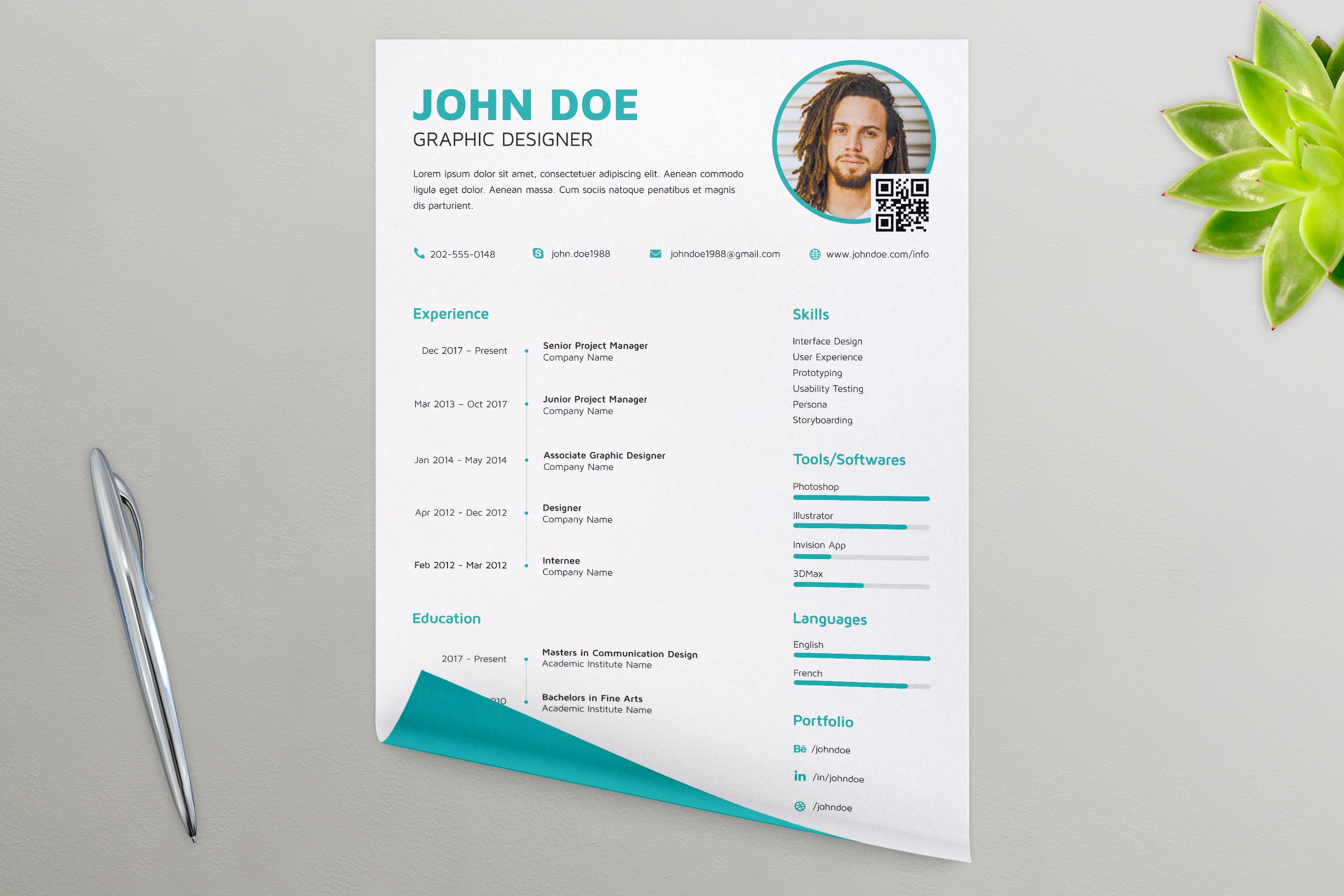
With it being on a mockup like this, it’s a little hard to see the exact quality of the resume.
However, I can see that a lot of the text is misaligned. It’s obvious how you wanted the “grid” laid out, but most of the text isn’t fitting within it. Such as the dates under Experience and Education, the icons under Portfolio, the text under Skills, and the bars under Tools/Software. Even if some of these are in fact aligned, they don’t look like it because of the mockup.
The “XP” bars are also a little wobbly looking, in fact, everything looks like it has a little bit of distortion to it, but again, that’s probably due to the mockup.
In terms of the mockup itself, I’m not sure if you made it or not, but I wouldn’t use this one, it looks very fake. The shadows under the pen and plant are too uniform around the edges, and the quality of the plant looks different compared to the rest of it. The fold on the paper covers up part of your design, so we aren’t getting the whole picture.
With all that being said, I think the design might just be too simple for GraphicRiver to take. Not that it doesn’t make a nice resume, because it does, it’s just there are already MANY simplistic resume designs on GraphicRiver, and usually once a category gets full of similar designs, they stop accepting items to that category, unless it’s something that really sticks out.
2 Likes
- dates are right-aligned and follow a strict grid
- All icons are uniform sized and aligned accordingly
- Right and left sections would never align with its individual components considering data will not be uniform in most situations.
- I believe the design is definitely par if not better than some of the accepted (relevant) entries I’ve found on graphicriver.
Heres a link to the file downloadable for free 
https://www.behance.net/gallery/79402089/Minimal-Resume
Adios
Your file is not original and doesn’t have any concept (this is the main reason for your rejection). There are too many similar items already accepted. Search on Pinterest for Creative Resume and you will find allot of fresh ideas. Think your resume as an advertising ad. And another approach is to create a resume kit with 10-15 layouts based on different jobs / industries.
1 Like
That wasn’t the reason for rejection. If that would’ve been the case; Envato could have stated that this had low sale value to them or something. As far as most of the CV templates out there; most of the ones i find a too whacky and out there and not for general usage. I wanted to design something basic yet that something that i feel fits my personal description of a complete resume set - with nothing to add (design-wise). It shouldn’t work for everyone but for a specific audience.
Thank you for your input!