Hello everyone, My second item now rejected by Envato quality team, I’ve attached my poster pack too.
If anyone can help me to see what is the exactly reason, I will be appreciate that.
Hello everyone, My second item now rejected by Envato quality team, I’ve attached my poster pack too.
If anyone can help me to see what is the exactly reason, I will be appreciate that.
Hello:
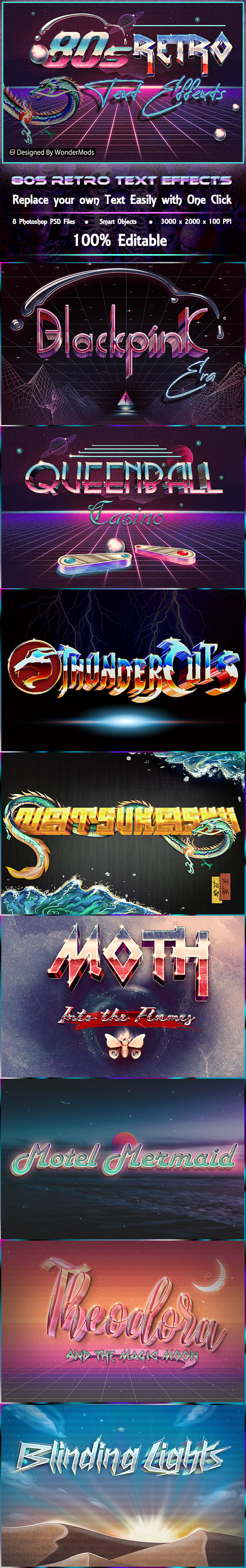
I think that your fonts, background, etc is too messy, need fix some better design maybe approved.
Regards.
I don’t think so. Maybe it’s my kind of favorite design and the style I choose to do. It’s named “Retro” and “80s” and it’s meant to be messy and full of colors. Fonts we used are meant to be sharp and edgy just like the way it was in the 80s decade. We wanted our design to be artistic and nostalgic. BTW thanks for your help and helpful comments.
I see no reason to reject your item.
Please don’t be discouraged. My experience shows that sometimes even very good items don’t get reviewed.
I understand that this is difficult and insulting. But try to make more items. If you persist you will definitely succeed.
You can make more items maybe will to be approved 
I also some my items was to be hard rejected because I am not expert to flyer. but I am learning use flyers.
hi as for me i rather like what u have though there are some things that u have to keep and mind and fix according to me and this is particularly as regard to presentation goes. The fact of the matter is that the most hurtful thing for u about the preview is that some of the text are definitely not valued , the combination of the presentation and theme makes the text not super visible and definitely not outstanding. Look, the goal of the people who may buy this item is precisely the other way around. If they buy such a add on, this is to make sure that their texts pop, have style, get noticed , which basically means that the text and the related effect must prevail. This means a lot about what u have , u should avoid to multiply the elements that will divert the attention of people away from what u actually sell and what actually what your potential customers want to buy … not to mention that this is combined with some contrast issue here and there. U are sometimes on the verge of violating the basic design principle, which is a good idea in absolutely no occasion, but in particularly in your case, i might add …
the other point is that no matter what is the screenshot that we are considering the presentation is messy … the elements seem to be pasted right next to each other and u have to choose what u feel like doing indeed. Either you just feel like focusing on the style and then, not much is requites around the text but a background enabling the style to be valued, or, u really want to put your item “in context” and then u have to create really solid complex compositions where all elements are properly placed , whereto style is valued all the same but which create a global atmosphere , as if u were offering a flyer or something like this. The problem is that, right now, u do not any of these two because of the way u have been placing elements and sometimes failed to scenerize the diverse styles indeed
finally, i was about to forget to mention about it, i strongly recommend that u avoid the things like putting the name of famous singers, the logo of a famous cartoon and so on … they are all copyrighted , i assume, so this is rather putting u into trouble rather than any other thing , not to mention that they do not really have a coherence, as no real link with the concerned layer styles and effects that they generate, which turn out to be rather cyber punk styles