###UPDATE: FINALISTS ANNOUNCED & VOTE FOR YOUR FAVORITE!

###UPDATE: FINALISTS ANNOUNCED & VOTE FOR YOUR FAVORITE!
 I want itunes to change itunes logo. i do my best to design itunes logo
Worth a try, good luck everybody!
Trying to keep it simplistic, but would be nice to have a social addition to iTunes.
Changing the view mode sets(New Music - Hot Tracks - Recent Releases - Pre-Orders - Rock Albums - Great Songs - Hot Albums)
I went with a more minimal and simple type of iTunes UI experience! Hope you guys will enjoy it, created in Sketch!

redesigned kind of the landing screen where the new music stuff and things is located. Probably not completely in line with Apple styling.
Hi! Here we go! 
iTunes redesign.
It is important to point out, that Apple has done a good job with iTunes, therefore the redesign must make sense, we shall not reorganize the content randomly, thus, let’s start thinking about the “Now” instead of the “Change”.
We have got a clean and tidy interface, but do all this items make sense? if we have got a music player and a shop, does it make sense to have all the controllers on the top bar? The first thing we will do must be to put together and show the player controller on the bottom, just like a music player would do, the content appears on the body, and the secondary actions on the superior menu.
Regarding the color, it is key, because it improves the esthetic and works perfectly to highlight and organize the items, in this case, we have made a white interface, highlighting the most important items, in this case the music content.
We have added a lateral tab, that changes depending on where in the iTunes we are located, showing relevant content of each section, using a balanced visual weight, where the items are symmetrical, and have the same visual importance.
In the artist page , we start showing each image (Trying to make it as striking as possible)
To draw attention, next to the name and a short biography, next would be the latest albums available, and a song list, sorted by relevance.
It is important to point out that all artist pages are customizable, so that each artist has a different page adapted to his/her colors and visual style.
Nothing summarizes better than a set of images about design:


This are only previews to show the page live, to see it on best quality look on the images instead:

Just for fun, good luck everybody!

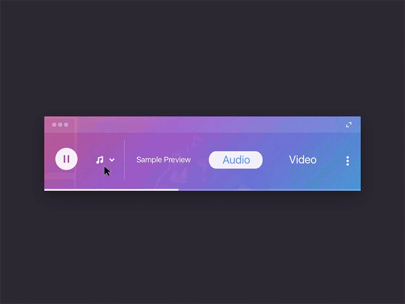
I think to redesign iTunes need big effort and scope to tackle the whole product experiences. So here i try to make tiny piece about it.
The concept is about the miniplayer of the itunes, with combination of apple music visual style. In that state you can buy audio and video, even the preview seamlessly.
Good luck and enjoy the game!
You can refer to my shot in dribbble here for a bit process behind it.