-
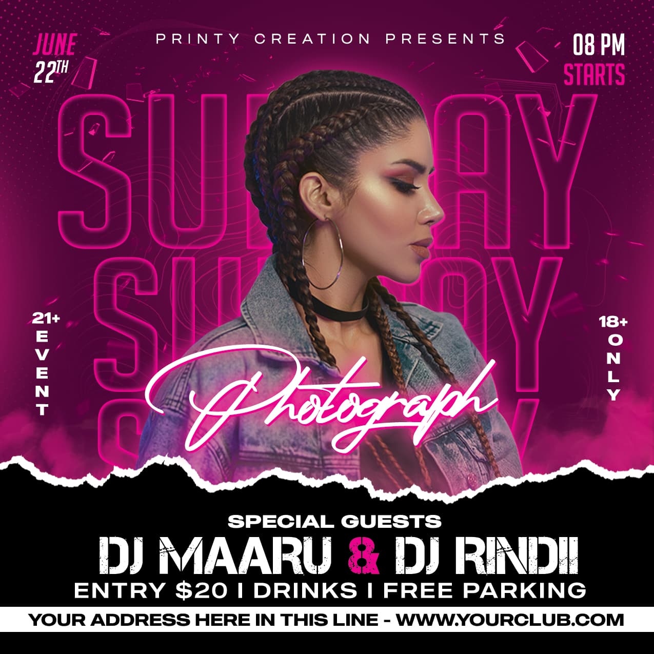
Nothing original that isn’t already for sale many times over
-
Too many fonts and styling
-
Spacing looks in consistent
-
The side text 21/18 is poorly executed
1 Like

Same problems - typography, margins, styling, originality
There’s at least 5 font stylings going on including some questionable font choices
The info bottom left and mid right feels lost and like a layer the designer forgot about
None of the side elements align properly
If you are designing for such a niche category then the design has tone pixel perfect
There’s a lot of similar items which are already for sale or free download, that with respect are executed much better
To be honest these both look like poorly ripped designs and elements from @storegraphic portfolio storegraphic's profile on GraphicRiver - same models, same text effects etc
Its just the beginning of Bon Jovi’s Wanted dead or alive. It’s all the same, only the names are changed.
Conclusion, this is the same design as thousands of the same flyers on GR.
A busy background, a female model and a lot of misplaced text.

It’s not worth giving detailed feedback - with respect if you think this is good enough and you can’t see what is entirely wrong, then you are not ready to be submitting items, and wasting both your own, the reviewers, and other authors’ time.
1 Like
I see a very basic flyer, nothing special.
When you skip the female model there is nothing but text.
It is spelled wrong also.
Tusday = Tuesday
Night Praty = Night Party
You must work on your skills and learn the basics of graphic design.
Hierarchy - Color management - spacing