Got rejected **
**. please help me how can I improve further?
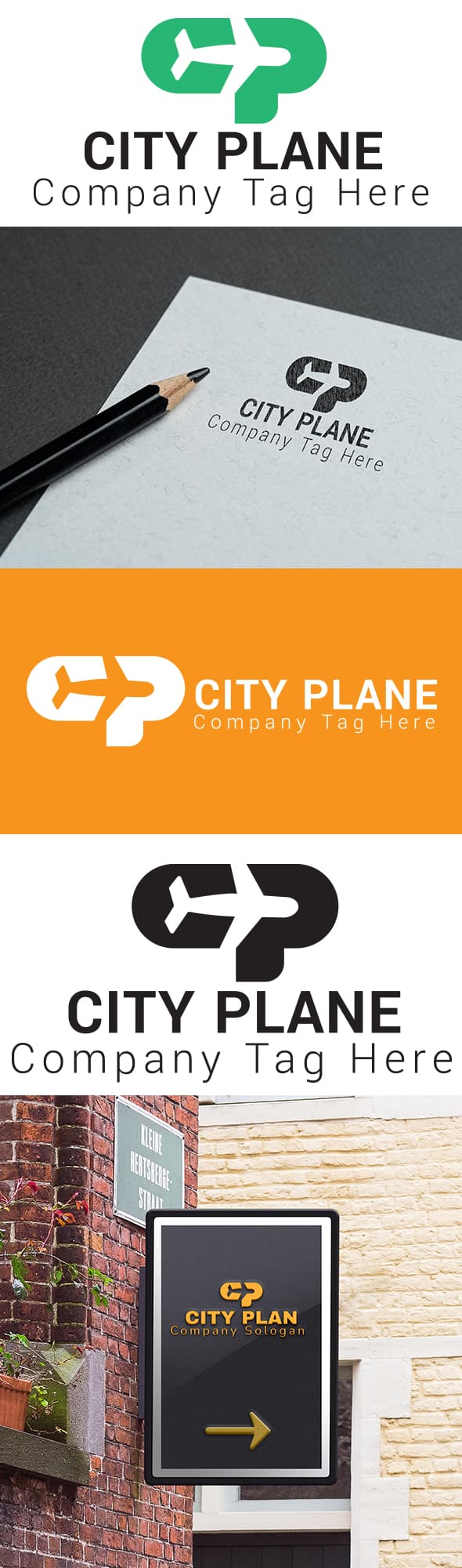
Better to get insight from the likes of @n2n44 or @DesignSomething but with respect the typography is just plain test and the graphic really doesn’t work
hi I am sorry to tell just this, but as regard to what the market looks like, and what is rejected / approved nowadays, u are really far from standards so that your item can make it for sale. Fact of the matter is that what u have at the moment is having countless flaws in many domains. First of, the concept looks rather weak in the first place. Then, the execution is far from being perfect and though it keeps definitely simple. There is no “effect” or whatever additional value to the very simple illustration that u have created at this stage and, overall, the execution time to redo this logo is not over 5 minutes. In other words, the commercial potential is quite limited to say the least. Indeed, for someone to buy an item they either have to identify that they will save some time out of buying and / or get a product over what they can personally produce in terms of graphic skills. In both cases, this is not what happens here … The preview also does not help to “sell” what u have created if u keep very plain color logo like this. Instead this contributes to flatten it all a bit more, again. This is really not going to motivate anyone into buying the product … There is also something wrong with the text part … not only is there no originality whatsoever when it comes to the used font, but, in addition, the tagline should not overcome the name horizontally speaking , just like what u have right now … Most importantly , u are also creating something really not convincing as far as hierarchy of information goes with the tagline being almost as big and prominent as the name … Finally, the imbrication of text and illustration parts is far from being super satisfying on the vertical version