


I feel like I’ve seen many logos that look very similar to all of these. That’s probably the main reason for rejection.
1-you couldn’t sell it anyway.
2-There is no trade in logos, because it is easy to copy.
hi u should do one logo per thread this would help people to help u in details
1- g letter
first of all the major problem, and i guess that some people would confirm if they feel the same as i do , i rather read “C” rather than “G”. u should put the text slightly up to have a better imbrication with with the illustration. The logo is lacking contrast and part of it, with such a gradient is a bit hard to read. Contrast is not a small issue , this is a basic design principle and the problem is that something not “popping out” enough is losing commercial attractiveness. The one color version is not perfectly executed if u ask me , as u are losing part of the detail and originality of the colorful version … u could have the very same relief playing with transparency and avoid to flatten th logo gamely in the process of changing color
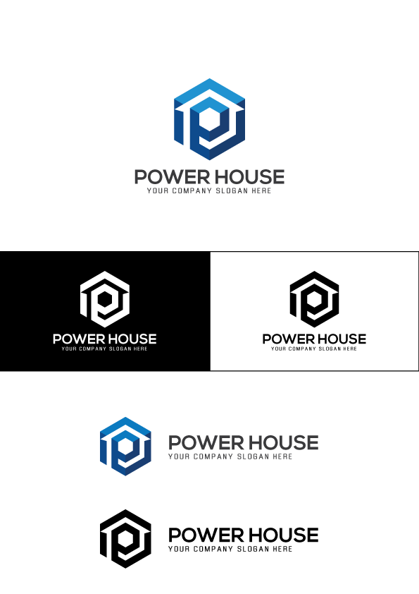
2- powerhouse
as for me , to be honest i do not see too much the link between “power” or electrics and what u have … though , maybee i failed to understand part of the concept, this is not impossible, we never know. But in any case, for me if u introduce power, then, i perosnally expect something bolder, that looks visually strong and sort of "dominating, but this is not really what happens here . For the colorful version, indeed, both text and illustration look disconnected in terms of colors and this is making u fail to bring more unity to the table indeed. In the horizontale version, texts are too far from the illustration and thus not perfectly well imbricating at this stage. Maybe adding a small original touch would help as this item is rather cool but also rather “deja vu” like …
3- reflect logo
to be honest i do not see anything much positive to say about this one … this is seen a thousand times this kind of items, all the sape, colors, geo texture … this clearly lacks personification and real originality touches if u ask me … once again, the illustration and text part look disconnected there is nowhere anywhere else than applied to the text and as such this looks like coming out of the blue indeed. On e more time both parts of the logo - illustration and text - are not imbricating well. The typo is clean but rather flat and a cool original touch would be welcome to say the least …
4- media
there is a clear discrepancy at this stage between the illustration prevailing gamely and the text being relegated to “secondary information”, this is bringing u into trouble for the hierarchy and also when it comes to aesthetics and branding purposes. Adding some blue in the text rather than this black coming out of nowhere is cool but as long as texts can still be read and the tagline that u have right now is close to unreadable indeed, maybe changing the proportion or adding boldnesss would help u so sold just this
5- hsutudi
globally u have a bit the same problems as for the other ones … first of all when it comes to imbricating text and illustration , about the typo being too flat and lacking originality , about the global style being sort of deja vu …in addition, the gradient that u use on top and at the bottom of the logo are good looking but make me think of bad perspective on the other hand. u also have an issue of promotion between illustration and text in the horizontal version , actually …
Thanks a lot !
u are welcome, happy if i could help u  if u have enough clues as regard to what to do with your item, just check the “solution” box , good work and good luck buddy