hi i think that u definitely had an effort of originality , though u have to understand that this is not the style that they really look for here , for many reasons and that u have a whole lot of things to fix also so that this is potentially making it here …
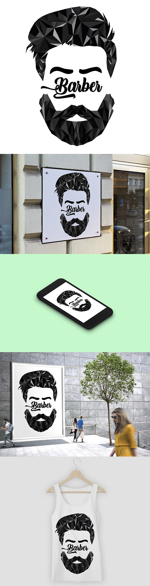
1- global style
this is too detailed here they consider the logo in very small size , try to imagine how the details look like in such dimension , u will realize that this will not look good for sure …
2- missing tagline
this is required and this alone can lead u to a hard rejection, in particular if they turn out to consider your work as not necessarily convincing in the first place …
3- adaptability …
i am almost sure that this is not the letter which is producing this monocle and that thus u will not have the same effect and that thus interest is decreasing in case this is not a B being the first letter indeed …
4- horizontal version
one of the major problems is that with what u have done here , there is no way u can have a horizontal version but the problem is that this is required … so basically u do not stand a chance to get accepted …