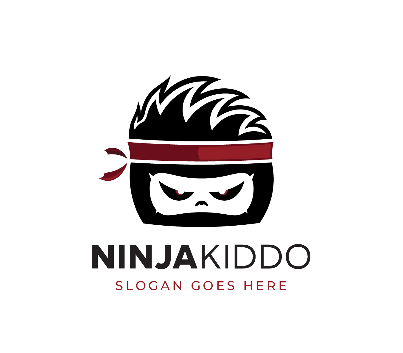
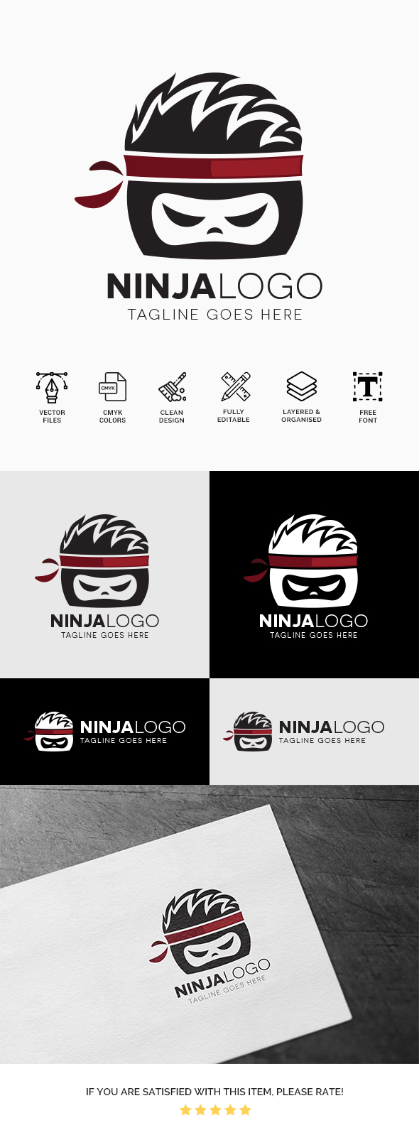
In case you have missed me. Here I am with with another rejected item. Any thoughts? Thank you
seems like normal to me
1 Like
hi the idea is cool and original too but the fact of the matter is that u are having execution issues as far as the hair goes and the typo is not satisfying enough for a place like here , where much effort is expected in terms of typo … finally the proportion between the text and illustration is not ok the illustration is prevailing too much over the text part …
1 Like