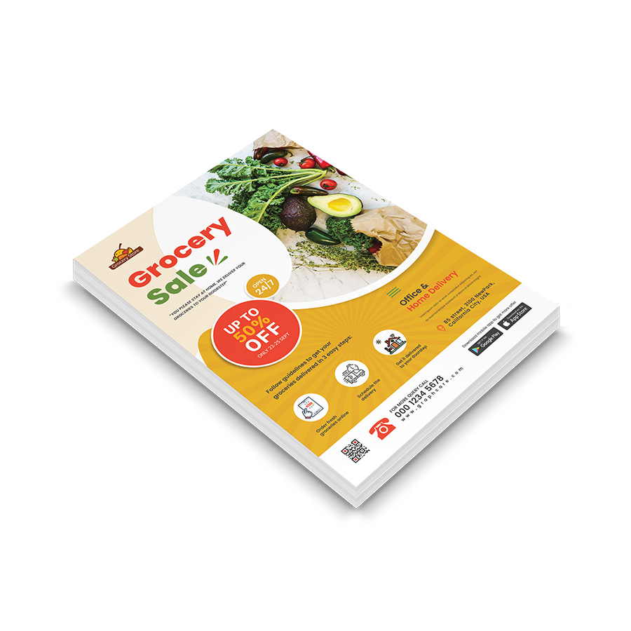
Hello experts, please give me a favour by reviewing my design @n2n44 bro

1 Like
hi, well indeed, this is tasteful but u have a series of things to fix or improve all the same …
1- contrast
this is not a small deal, contrast is a basic design principle and this alone could lead u to a hard rejection indeed. Violating is also not a good idea as this is bringing u into facing further trouble in the process … as u can see , some of your texts are hardly visible or readable , so what is the point to have them anyways … see point 2
2- hierarchy
indeed, the contrast thing necessarily brings u into facing some trouble about hierarchy as some text not valued and this is not always the most secondary ones … “office and home delivery” and “open 24/7” turn out to be commercial arguments that a company would value out of being part of the thing that make them different , the information must be treated as such
3- lack of relief
this is still more or less a consequence from the contrast issue, but not only , as this is due to a lack of finition on some elements, like the bullet , which looks pretty flat to say the least , but this is just an example
4- readability
that was evoked mainly in the contrast part but there is more to say about the subject … the more u will make text cross complex background, melted pictures, or some design element in the background, the more the text will be hard to read and will require special attention so that u make it spring out properly and make it look readable …
5- ???
sorry i do not know how to call this lol but i am wandering what is strange kind of white egg under grocery and sale?
6- icons
they are too simple and basically too stuck in the bullets and this is preventing from breathing, the direct consequence is that this is not looking super good visually to have them like this , in this disposition, with this color and so on … see point 7
7- homogeneity
this is a real problem that u use a set of icons and that one of them looks really way bolder than the rest like this … i guess u can identify that this is killing the harmony of what u have created otherwise
8- coherence
i am sorry but for me this makes very little sense to have services “emphasized” like this without being emphasized, in the end lol what i mean by this is that u try to present the concerned services but the icons are not really set properly and the text associated with each of them is not much readable and most importantly clearly does not pop out so that the services are given the right attention
3 Likes
Thanks a lot bro for your opinion
1 Like
u are welcome , if u have enough clues of what to do pls check the solution box, good work and good luck 
Your support was amazing. I have checked the solution box. Thanks again brother
1 Like
u are welcome , happy if i could help
2 Likes