Hi everyone…
I don’t know if I’m sure my flyer work is fine or not, because I find it common.
My Flyer:
Original (item graphicriver):
I hope they help me, thanks.
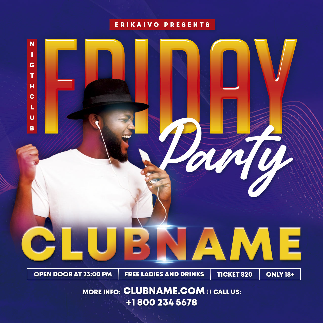
Hi everyone…
I don’t know if I’m sure my flyer work is fine or not, because I find it common.
My Flyer:
Original (item graphicriver):
I hope they help me, thanks.
The fact that you copied another item isn’t very good. Sure you can take inspiration, but copying the whole layout and most of the design aspects is no good.
The lighting and gradients on the model are very strange looking, same with the colours and text gradients.
Which author best design for flyer inspiration?
blue flyer
there is no originality whatsoever out there … the text look like they have been pasted right next to each other and definitely do not look either organized or arranged properly for reading matters. There is no cohesion in terms of colors as well … and the multiplication of bullets is having the completely the inverted effect of the one you were probably searching for. The more bullets u have, the more the ones u have actually have very little impact , not to mention that this is increasing the disorganized feeling generated by the lay out. Having bulky / massive text like this is just here to conceal the lack of work across the flyer indeed. This is fulfilling some space, period. This is not what u are expecting for a professional designers trying to bring quality to the table … Look, once u have taken out the model, what is left in the end? flat text, rectangles with text inside and a line net that u can download for free in many website … so basically enough, what are people supposed to be paying for? and in the same extent, why would a reviewer approve such an item? I have told u a thousand times already … your focuses should e originality and attention to bring worked out designs. In other words , that u change gear from producing a lot of super average things in most cases to way fewer ones but really consistent. I will also reiterate what i used to say … all your flyers ave the same components, this cannot work on the long run! header , always the same, fonts, almost always the same and many other things like this. U need to bring your own touch, unless u manage to do , u will always have trouble to get items approved, to sell and so on …
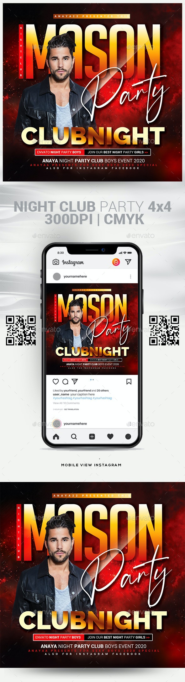
mason party
at least this one is way more harmonious , this is already not so bad in a way … though, disposition and so on are the same so most of the “criticism” that were expressed for the other one can apply to this one, as well. Main titles are not outstanding enough due to the gradient that u used that is not contrasting enough. Besides, u are already on the verge of violating a basic design principle with this main title part but u are completely ending up violating it with some other text … i assume that u can identify that , even for a secondary information if the text color and the background are 90% the same , then the text is not going to be readable …so what having the concerned text? I also have absolutely no idea of what a “mason night” is lol but maybe i am failing to understand what this is all about , despite this is “famous” lol still about coherence things, do u realize that there is no coherence between title, footer text and so on ? the title says "mason night’ and the footer says “anaya night”. IN the same logics, what is supposed to be “club night” ? the club name? if not this is no where to be seen otherwise and i used to tell u to value the club name as a club owner coming to buy a flyer here wants his club to be remembered so the space for the club name should be a central one and the tree should be put on it! i may also underline execution problems as i have trouble to believe that the hair style of the guy is something else than a non mastered cut from the background or a failed montage , judging by the “choucroute” that the guy has on top of his head … once more, there is no shadow on the text , behind the guy’s head … the cutting looks even harsher because of this the composition gets even less credible in the process, too
easy answer >>>> good ones …those who spend time to create their things , pay attention about details, make sure that they try to bring originality to the table both in terms of concept and lay out
If you copy this for practice it’s ok but if you want to upload it’s called theft and I’m sure @AnAYa22 is not happy with this. Anyway your copy is poor.
I’m not sure if my design is fine, so I uploaded this forum message. I want to practice something because graphicriver will approve my designs.
They won’t approve anything that is so over inspired by someone else’s file, regardless of technical good/bad of it
Thank you very much I am learning to practice more for approved in graphicriver.
lol “they are not supposed to” would be a better formulation … i remember that i had to contact the help center after a guy had downloaded my toy drive flyer , changed two small details and had uploaded it as his own flyer (thus stealing a couple of sales from me with the item he had stolen) … reviewing is very difficult , especially as regard to the amount of files that they have to treat , this is why i said “supposed to” as they are of course human and this is impossible to remember all the files that they are dealing with, naturally enough …
u are misleading Jeri … learning is not copying items … this is learning out of analyzing techniques that people use … as i use to tell u , observing what other people do is very important for that matter it helps to think about new ideas, of course, but most importantly when u managed to understand how they have done this or that , u can apply th techniques to your own ideas and take your creations to the next level
Thank you very much, I will learn to make any design without copying another design.
n2n44
One question … If I reject all my future designs will they delete my account?
no, Jeri , if u get too massive rejections, indeed , in the worst case, they will “freeze it” and disable your upload rights for 6 months …
That has not gotten a notification because my designs were rejected multiple times.