hello to all:
please feedback my logo before upload graphicriver, regards.
Is the word “Stream” fully editable? If not, then that alone would get it rejected.
The colours and content don’t really fit well together, the text is all very modern/futuristic and fits the gaming theme, but the person, colours, and general aesthetic look outdated. Honestly, the first thing I think of when looking at the whole picture is wheat or some sort of harvest related thing.
The banner shape conforms to the shape of the text, which not only leads me to believe that the text isn’t editable, but also that if someone does try to change it, it will no longer fit within the shape of the banner.
The linework is very basic which I think is a major detriment. Take a look at the example below, the lines have different weights, they taper off at the ends, and they’re used mainly as an outline and to show major details, or as a dark shadow.

Another big thing is the shading. Most, if not all E-Sports logos use cell-shading rather than gradients. A good way to do it is to choose 3 shades per colour (Midtone, shadow, highlight), so in your case the red cape would have 3 shades, the blue shirt would have 3 shades, etc. Use shading to help give the subject some dimension and to create smaller simple details.
You have too much detail, especially in the eyes. You should stick to simple shapes. Looking at the example logo above, you can see how they did the eyes, I would do it similarly but also add a small white shape to make her more human.
Her pose is also quite boring, and the position of the sword is… unfortunate. You should redraw her with her arm holding the sword above her head, like a heroic cheer, sort of like the image below. This would make the shape more dynamic and give a more energetic feel to the whole thing.

yeah , this is right for most of the things and i already told her most of these by emails. One thing that it seems to me that u have forgotten to mention (pls correct me if am wrong) is that most of the “e-sport-like” logos are also using definitely super thick strokes - she has already improved a bit about this but this is not really homogenous at the moment - and i have already told her to fix this as she has also has a too much varying stroke between the outside and the inside of the illustration. I also agree about the discrepancy between the styles of the text and the illustration, i am afraid that at this stage she does not master the illustration so very much so that she can do e-sport like all the way and the thing is that beforehand, she used to have a text more matching, what i have already told her by email too … at least the content text and drawing was more coherent , even if the global style of the illustration is not the most model one that we may imagine indeed. I am also afraid that she cannot identify exactly what u are saying as Jeri, at this stage is not speaking good enough english to get to understand the very deep detailed explanation that u had for her … she needs u to list things up by point with as straightforward explanation as possible if u wish. I already explained to her about the shadowing, the strokes, text style and so one, and the necessity also to bring more relief to the text
Sorry my design illustrator is too basic, I try improvement my design mascot like image @XioxGraphix
Thank you so much…
u are developing skills Jeri , this is good, as i used to tell u , Rome City was not built within a day as the old french saying goes … keep on fighting and doing your best this is paying off 
Thank you to much @n2n44
I am still achieving for my mascot logo,
I have to faith one day improve my design
if u ask me designers need to either have faith enough in themselves, their potential and talent and enough doubt not to stagnate and to keep on doing their best. As i told u many times already , in this industry, u have to kind of pay your dues , it takes time to develop skills , to have level up about your productions and so on. Some people consider that u have to be obsessed to be successful. They are certainly true. But i guess that observing a lot of things , especially as for as what other people are doing is helping much. U learn much from other people. I think that the second thing is to have a real concern about quality. Some may be successful out of creating quantity - we all know some here … - but this is not the real deal
try to take the name of the character and tweak it a bit lol this is Leia , right? use Leila for instance … LOL
Thanks this word helps me a lot… i have been searching for which shading method people have been using now i got a answer
Looks like naive painting / illustration. You can keep the naive style and create more elaborate illustrations.
You have big anatomy issues with this one. Use references. Ask your husband to pose in the same posture and take some reference pictures.
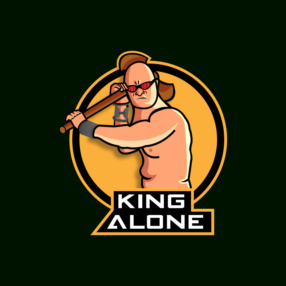
He’s not - this is how 90% game streamers looks like. 100% legit work. 
If you are happy with it it’s ok.