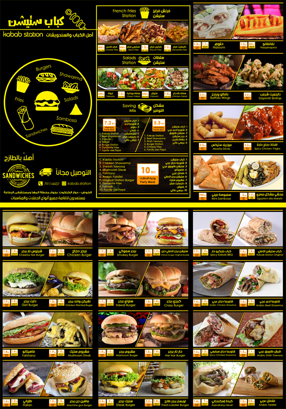
I designed this and took me hours to create then envato sends me a rejection email saying “the design isn’t at the quality standard required to move forward”.
Is it because it has another language in it or is it really a poor design? can someone please help me with this and how to make it better?!
Thanks
With respect, while the mixed la gauge may not help, the fundamental design and execution is not really at the standard required.
The colours, typography and icons make the design feel a little basic and there are fundamental fixes required throughout especially with spacing, styling, alignment, typography and hierarchy
Ok, thank you for your reply!
at least now I know what to consider when designing such flyers.