please any reason for reject this logo
please any reason for reject this logo
It’s cute, I like it. But GR reviewers have a different opinion!!! They are hard to please nowadays!! 
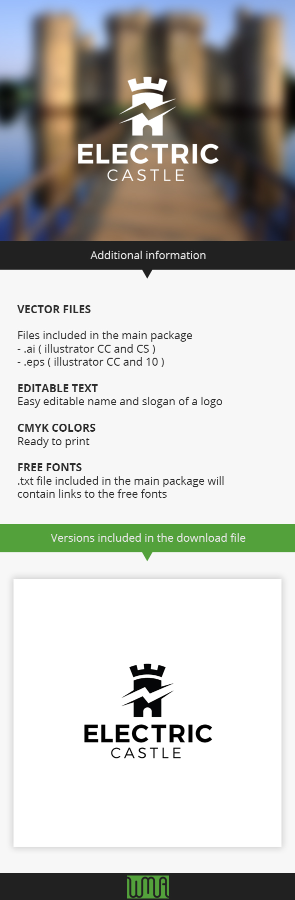
I think the main reason is the unclaimedy of this logo. Do you know a lot of castles owners who need logos(especially owners of electric castles)? “electric castles” … what is it? I can not even imagine.
Great design but an unique concept - it’s the reason, I guess . Go through the LINK, and read about “sodaplane” (“Logo Templates must not be too specific, and should work well with a variety of names”)
thank you for replay, I’m happy because of you love my logo
I think my logo differs from the whole difference sodaplane logo, and thank you for reply
I think my logo differs from the whole difference sodaplane logo, and thank you for reply
@waleedmalraggad you better follow @romlam advices. Your logo is good, but not exploitable. “Electric Castle” really will be completely unesuful for envato customers. Most of castle owners has problems to keep them in maintenance so they book them for techno ans disco parties. The reason why I teel you this, it’s because you can keep the same design, but use “Party Castle” text. Look at this video: https://www.youtube.com/watch?v=yEbrvMljMCg
this castle is located in France and it’s a private one. The owner need to earn more to keep it, so he book his Castle for parties.
It’s just a suggestion, but they will give you an hard rejection even with this party castle logo concept.
Yes, you are right
but I did not mean to have design for the owners of castles, intended to be designed for owners of electricity companies.
mmmm… so I think you’re out of the way, completely. If I try to imagine be an electric company owner, I’ll certanly never think to call it “Electric Castle”. Maybe I could be in a private context, but you know, on a commercial context as envato, you must think more about standard things if you understand what I mean. Again, your logo makes think more about a castle meant as a property than an electric company. Good luck! 
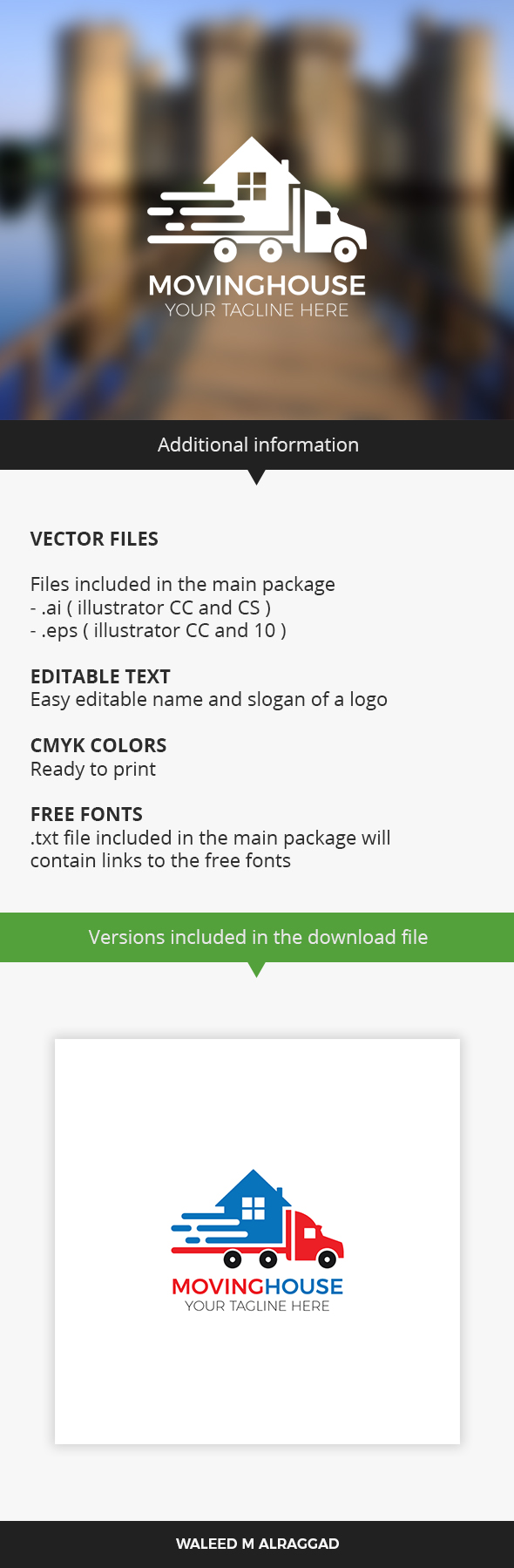
Maybe it’s too simple, and certanly, another reason it’s the main text. You should put some space between “moving” and “house” or, if you want to keep it as a single word, use bold version for “moving” and regular version for “house”. Moving House should be muche bigger then tagline.
Also, you should put a fantasy name for this kind of logo:
Good luck
thank you so much, I will try again 
Nice Logo

I do keep watching your rejected logo 


As I told you yesterday, maybe the design is too simple and look too old style. The best hing you can do is to navigate trough the others works on envato and follow the trend.
thank you i upload new logo and I hope to accept it
Try to share your logo here before uploading to get feedback. In most cases when they reject a logo, they never accept it again.
thank you for reply, I will do as you advised