Just got an email informing me of a hard rejection (quality standards) on my site template submission. I’m looking for your feedback on the reasons that could be the causing that rejection.
Demo: http://robo-theme.bitballoon.com
Please if anyone can have a look and let me know my mistake(s) so I can fix it in next time.
Thanks in advance
Hello and welcome to Envato Forums,
First of all your item is far away from being accepted on the market, sorry because I’m so drastic but this is the true (at this moment); but remember, you always can improve your work/skills… etc:
I will give you a very quick and short feedback you can use in order to learn how to make your item more attractive, how to use color combinations, fonts, paddings, spacings etc.
Here we go:
-
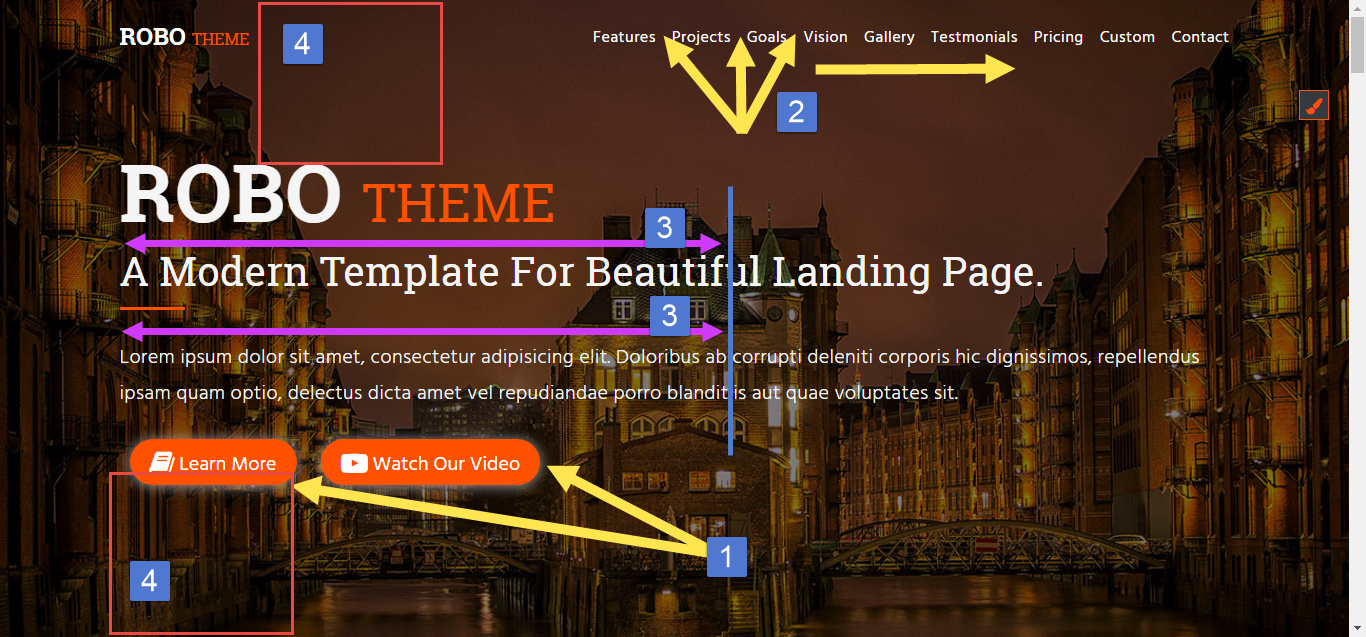
4 issues in your template’s first view:
Issue 1: Shadows too prominent. Make those buttons so ugly.
Issue 2: Bad spacing between menu items. At first check I thought that is long paragraph instead of links.
Issue 3: Your Heading/paragraph from the main view is too long. Make it half size of the view;
Issue 4: Spacing issues;
-
This space is horrible. Solution: Simply make the white div 100% of the page without those spacing:
-
That read more button is out of place there. It should be centered as all the other elements from the block:

-
Spacing problem on buttons (check all the btns from the site):

-
What is that? It needs to be removed.
-
Too much Lorem Ipsum. Add some relevant content.
-
Too much white space all over the template:
- +make the headings bold/bolder.
- Stretched images + inconsistent spacing:
You should check some approved items to learn how to deal with spacing, typography, colors and many other things. At this moment I don’t want to see this item on the market (in this shape)… quality should evolve not to step back.
Good Luck!
4 Likes
@ThemeSLR
Thank you very much for such valuable info I’m realy pleased to be these helpful knowlage.
Please allow me to mention you again in this post after I resubmit this item after make changes you opened my eyes on.
Again thank you very much.
No problem, I’m glad to give my feedback; But don’t forget: these are only few problems. Pay attention to details and always check current design standards (approved items).
Regards and have an wonderful week!
1 Like
Your bad design:
-
I not like loading background orange but you need add color black or white and icon orange or other colors.
-
Shadow buttons, no need shadow buttons
-
No background gray but white and section change background black or gray light.
-
Too spacing
-
Pricing need buttons “buy more”
-
Footer no need fluid container
-
Bad colors
Your design is too basic your need practice more. Regards.
JeriTeam.
1 Like
Thank you for your feedback. I’m already Improving it right now