Just got a hard reject (quality standards) on my html template submission. I welcome your feedback on what could be improved.
Demo: http://themes.webiots.com/domain
please if anyone can check and let me know what is my mistake so i can improve in next time
With respect it’s way off
Can only see it on mobile but there
-
all sorts of spacing and layout issues
-
page jumps about with typing text effect
-
repeating “test” domains and content looks unfinished
-
hierarchy needs work
-
typography and fundamentals need tidying up
page jumps is because of typing js so we should not use
can you and others also look on pc and give more bugs so i can improve myself
thanks once again
It’s better on laptop but still fundamental issues with spacing, typography etc. across most demos
e.g. http://themes.webiots.com/domain/demo-7.html right-hand margin is not consistent to rest of that section
e.g. http://themes.webiots.com/domain/demo-9.html footer needs improving and typography could be better
As mentioned mobile problems need attention
You can still use the typing text jus lock it so that when it is longer or shorter it does not influence the rest of the page
@charlie4282 thanks for wonderfull suggestion i will look into spacing and typo graphy
can you check for me themes.webiots.com/appexia/ , this is new theme before we submit i thought to check with you so i can know i have done perfect in new theme so it does not get hard reject
Your new template is not so bad, but it will need a lot of work before being submitted. Otherwise, you’ll get the Hard rejection message. As is, it feels quite unfinished and still has some buggy features.
thanks @cssninjaStudio can u highlight which are buggy features or things so i can improve more
thanks alot in advance please mention in details so i can not make such mistakes again
Well, I can’t give much details, because it’s a general feeling, but here is an example screen from my mobile :
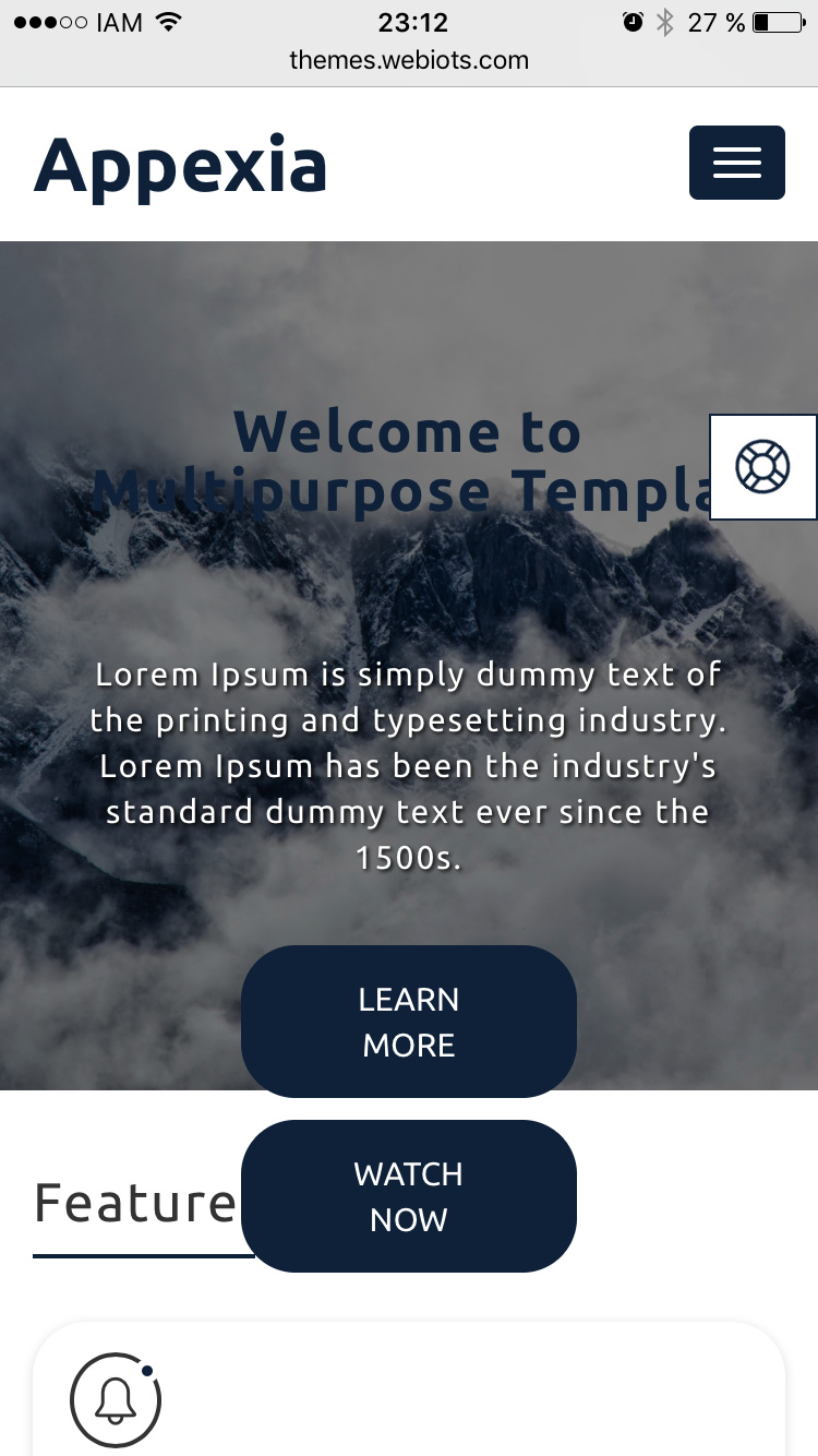
Typography needs to be reworked. Buttons look quite bad (personal opinion though), and there are spacing and alignment issues.