Hmmm, text is a bit of a mess, especially below, you need to learn how to clean it up, and make it more presentable, and easier to read.
And your bleed lines are out, it is best to create a square with .125" width and height, then see if your lines match it, (well your first print line).
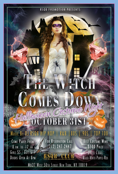
release it as freebie somewhere and try again creating something better. its definetly not fullfill the quality requrements to be sold on graphicriver.
Main header is still too hard to see, and l would get rid of the angled Halloween Costume Night text. You are pushing your luck with that one.
I would use a dark gradient behind all of your text, (quickest way to fix some of the issues) just take a look at some of mine for examples, (well, click on the T icon, etc to take a look.
Hi RSQB, i suggest you to read more about font pairing and hierarchy, there are several typography issues. Once you fix the typography work harder on the overall design and try to blend it better and make it look more realistic.
Yes, that is a lot better, but you still have text issue. Never have text that loses some of its width, or have a word that is smaller than the one above and or below it.
And if you have to then use a spacer graphic, to break it up, (as l have done).
It will probably get rejected again if you don’t address this issue.
Your bleed lines are also out, my flyers are a bit larger than yours and the mods, told me to fix it, so…
Easierst way is to make a new square with .125x.125 inches then pop this into one of your corners.
The primary bleed lines need to be touching the edges of this square, in order for the edges to be 0.125 inches.
And the backup lines also need to adhere to this measuring graphic to be correct!
I would say once those issues have been addressed, you could risk it and try again, since the design has substantial differences,so it should be ok to retry?
But if it gets canned again, it is best to learn from this, and move on.
This is one of mine, which is bigger than your ones, as you can see the bleed lines are way smaller than yours, (this is after one of the Envato team told me to fix this issue.
And l have also pointed out the text issue.
Best to click on my Avatar image then the link provided to see all of my work, and get some ideas as to what is allowed and not allowed with text placement.
And this shows only one bleed line, (their should be three, so you pretty much got that right)
Remember that bleed lines are zero point one two five of an inch on one side, so are tiny, (like my example shows) and as said before make an shape with the same dimensions and measure from that.


