Please check the attached file and give the feedback.
Thanks
hi there are some interesting things in this card but also a lot to say at the same time …
first of all difficult to understand the alignment … one side there is the logo on the sideway, in the other one the main information, name etc being flagged in the middle , which make little sense if u ask me …
second of all, icons are too flat
then, this organization with lines leading to the related info is not only unaesthetic in my view, but also really not intuitive too …
next, the typo is flat … there is no originality at all, this is lacking variations, lacking combinations, there is basically nothing popping out
so , this basically means that u need to do a real work to bring a significant hierarchy of information to the table … what u do not have right now …
positioning, some positioning look sort of very random in a way … vertically for the personal information and both horizontally and vertically when it comes to the icons in the logo side of the card
some shapes are not properly placed like this unlike u accept that they will “not make it” and be part of the trim line
Hi Thanks for your feedback . I know you are a good designer. I am learning a lot from here.
Please give some feed back about the attached .
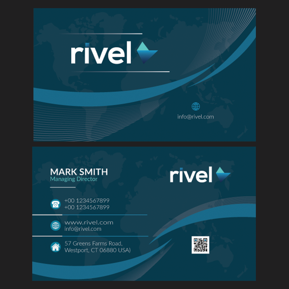
hi i am sorry to tell u just this but there is something dissonant in what u have done here … the logo is very angular and this is place in a context where there are a lot of waves, in other words, style of different elements are clearly not matching if u ask me, so u either have to adapt the logo according to the context or the context to the logo , since, as such the harmony is not here … besides, still about the overall style, let’s face it , there is nothing but deja vu in what u have done here u definitely need to introduce a creative and personal touch …
there is otherwise, apart from this type of global style issues, some other issues, like the positioning of elements in the right sides … why are these elements so much in the middle and not filling the gaps in the bottom right corners?
u also have an issue of alignment in my view as in both sides the block of information and the logo are not aligned, this may not be indispensable though, combined with the other things, this is contributing to make a difference as all details matter
however , the main issue is that typo and hierarchy of information are very flat to say the least … if u have an harmony thanks to the use of color, the use of color is also underlining this lack of relief generated by these flat typo and hierarchy … no texts are really popping out much in the end while the formation still is the main reason for people to have a business card …
otherwise, let’s face it , i said it a thousand times already but icons this very flat and being just photoshop presets are not a good idea when it comes to a marketplace context like this one …
finally , may u explain what is the purpose to isolate the email in the logo side when u already have it in the other side with all the rats of the information?
Hi
Once again I am here to disturbing you . Please see the file and give your valuable speech .
Thanks
for the mickle smith one, u have a blatant lack of contrast , not only let me remind u that this is breaking a basic design principles, but it also bring u to get into trouble for many other things , too! as such the card is somehow someway rather inefficient as a good deal of the texts are either not readable or in the best cases , they are really not popping out at all. Let me remind u off the fact that a card is mainly meant for people to show their personal information to others, which basically means that if these pieces of information cannot be read , the card is useless …
do not get mr wrong , i like what u have done with the background , but this background combined with the lack of contrast also leads u to increase the readability problem that u have generated otherwise …
in addiiton, icons are too flat and look like photoshop presets and this is not a good idea to say the least
these waves like this have been seen billions of times already and bring nothing to the table apart for a very hard time for u to position texts and information , so basically doing without them is, in my opinion , a very good idea
u have hierarchy of information issue mixed with readability problems too, take closer look at the function, this is nothing but invisible! this should be an important part
finally the fake logo that u have done is not bad, however the positioning of the tagline ruins it all , u’d better flag it on the left and get a more harmonious logo in the process …
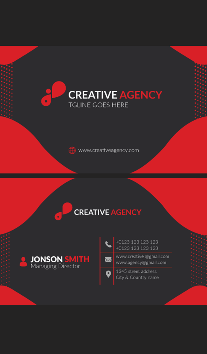
for the johnson smith one
all there is an attempt to bing some originality but the thing looks definitely too raw for me as such , not to mention that there are some issues as regard to execution …
first, u have alignment issues with the icon set for instance they are not aligned properly in between the two dividers … still about icons, they are too flat , lacking creativity or originality
the background is lacking originality and / or texture and there is an impact on the commercial potential of this item … why would anyone buy this card when they could easily redo it in a rather short while? u need to push the envelope graphic design wise
opting for increasing the contrast between background and elements would be a goo idea too , this would make elements more visible, texts more readable and emphasize more of a hierarchy of information …
hey buddy , next time , pls warn me before i have to see this lol i need to put my glasses on beforehand! lol well , sorry i am teasing u , but seriously do u realize the kind of color combination that u have here?! lol i am not sure that the green is supposed to be part of the card or not but whether this is for presentation or in the card does not change anything in my view, if i were a reviewer, i tell u straightforward , only the use of this horrible color would mean a direct hard rejection as far as i am concerned … think about it, buddy, lots of guys have a presentation using beautiful professional mockups and u come out there with a dirty fluo green which takes some glasses so that people can be able to look at it … that would take a an incredibly exceptional business card template for people to only consider your work , in such conditions … . The problem is , in addition, that your card is far from wonderful … sorry i do not say this to hurt u but just to make u realize how much the green is a mistake and how much u had no chance at all to make it using such a thing …
to go back to the card itself, here is what u have to fix or improve according to me …
1- global style
this is too flat , lacking of graphic design and thus of originality
2- lack of originality
u need to introduce ways to make your card different from all what is existing already (i mean apart from the horrible green lol, kidding, peace! )
3- hierarchy
hierarchy of information is close to non existing, pls see next point for further details
4- typo
this is too flat at this stage , u have no real originality into it and this is both lacking variations and font combinations, in the end u could manage to give no relief to anything at this stage , when this is expected from u that u value some pieces and “determine as secondary” some others …
5- colors
green or not is not changing anything about it in fact , the colors, blue and black are just too dull, this makes the whole card look austere indeed when your goal should be to attract people visually speaking
6- contrast
well whether this is about texts and / or colors, all is lacking a lot of contrast , this is contributing to make u fail into creating a real hierarchy and a visual attractiveness . I guess that the worst thing about lack of contrast is without the shadow of a doubt the logo in the information side …
7- logo side
as for me when i see such a situation i always feel the same, why would a 2-sided card be indispensable if one side is so very empty as the the one where u placed the logo … better go with one side if so …
8- alignment
it seems to be perfectible about it in the information side it looks like that the spacing between the qr code and the edge is not the same as for the other side, the spacing between icons and the edge …
pls check the “solution” box next to my answer for this thread and next time u have a new card rejected start a new thread … thanks in advance
Speechless.
Why
The second business came after the @n2n44 very detailed comment. This is all you understood? That’s why is speechless.
Please give some feed back about my last work.
Thanks
Apply all the feedback above. I don’t have time to tell you the same thing all over again about typography, concept, originality, colors, contrast, alignment, spacing etc.
lol buddy! you want me to go blind or something?! lol next time i should put my glasses on LOL sorry for the joke and teasing u but honesty the flashy green like this is very aggressive for eyes! lol not to mention that u should keep in mind that according to activities and expected feelings generated , there are supposed color codes indeed …
otherwise, u have issues of execution as regard to the way shapes are made, some look uneven indeed …
contrast of style is much of an issue … this is never a good idea indeed to mix angular shapes with very rounded ones indeed … u have this in both sides …
the alignment in the logo side is not good enough u should push the logo to the left side so that this is placed in the middle of the white zone!
the texture is not visually attractive in my view …
for the information side now:
the different blocks of texts are not equally aligned …
the icons are really too simple and they bring nothing to the table … even graphically speaking …
the logo is misplaced , too close from the edge of the shape under …
flagged texts - name ad function - are not well arranged in the bullet under
the typo is too flat , lacking originality , variations and font combinations …
Thanks for your help.
this is ok, happy to be able to help, pls check the “solution” box  good work and good luck
ps : pls try to keep in mind all what has been done for your next creations