Hello Everyone,
This is my rejected item. It would be really helpful, if anyone can feedback on my design, why it was rejected, what was missing and how it can improved ?
Thank you
Hello Everyone,
This is my rejected item. It would be really helpful, if anyone can feedback on my design, why it was rejected, what was missing and how it can improved ?
Thank you
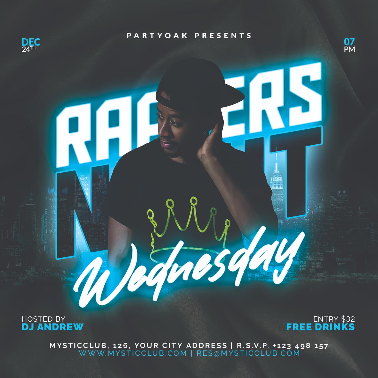
The main title is unreadable. When you partially cover it with the model make sure people can read it.
There are tones of similar flyers. The market is over saturated with this type of designs.
Also you need to work on hierarchy. The first important is the title. Second in the artist / DJ. Third is the date and followerd by the rest of information.
Thank you for your feedback DesignSomething. I will keep them while creating my next design. May I know, How to create design which are new ?
Check the new graphic design trends
You can do it better. Maybe next time you will have success.
This is way late … but I think the problem may have been that the title is not easily readable. I had to think hard in order to figure out that it’s Rappers Night. Many persons would not be able to figure it out … especially the word ‘Night’. And the other thing is that the date and time at the top are lost. It took me a while to see them. Maybe if they were at the bottom with the other obvious text. But apart from that it’s cool. I like the simplicity of it.