Dear Mod !! I have tried to perfect my product after being rejected many times. It’s really hard to understand the standards of Graphicriver. Can someone please tell me why this product was rejected?
hi for me u have a matter of style for the first one as this is quite all revolving around the central heart that looks good but this is quite empty otherwise graphic design wise. The texture of the central font maybe discussed and most importantly the title is sort of a bit massive bu lacking originality , combinations and maybe variations so that the central texts look a little bit less like a big block so to speak …
the background elements do not look like completely melted and look a bit like u have put some illustrator made illustration that u failed to melt in the photoshop background in my view …
though this is rather harmonious
when it come to the “love valentine” one there is a very cool balloon part in my view and i like the background and i feel a bit like u have been messing with all this with lots of glitters that look a bit pasted there and disconnected from the style of the rest
for me the swatches bring nothing to the table and indeed they are rather ruining the aesthetic a bit and same goes with the rose, even if i also identify that this is bringing some sort of originality to the table with the crossing effect that u executed well indeed …
the disposition of date and time makes no sense at all in my opinion and is not aesthetic either i would recommend u to gather both , focus more on the date and put the time in smaller size and try to sort of imbricate these two text parts … i think that u should take out a line from the footer and give more a margin on top and at the bottom of the flyer so that texts are breathing more and that u have a bigger space for safety zone plus breathing
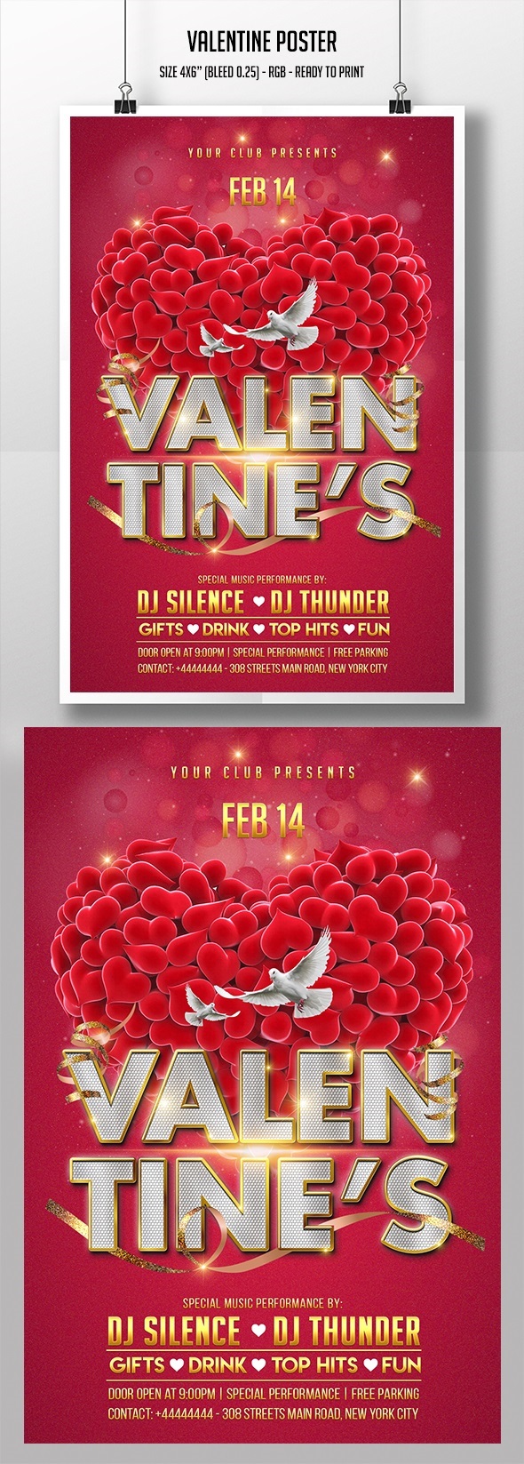
hi this is not bad but u have kind of coherence issues since hard to understand on what the heart and speakers ae being out lol and in addition , u really have too much of a wild range of colors being used. Indeed, globally there is a matter of cohesion in terms of style, there is a bit of feeling that u have been mixing elements from here and there and , out them together but could not completely managed yo make them match … the central text is huge if u ask me but maybe making a bit bigger would be even better if u ask me … lots of people really like a massive central title in the middle and especially when it looks good like this … u have to pay attention to alignment otherwise … in the footer gift , drinks and so on ar not aligned properly between the two dividers … i guess that adding to a smooth shadow behind the singer would not hurt too … especially if u feel like keeping it but i am not sure , maybe doing without it could be even bette , just give it a try and do according how u feel … oh finally if i were u i would push the date up and make it get closer from the main title …
I agree with the author above and want to ask you where do you get the elements for your design, if not a secret, or do you create everything yourself?