Hi,
I’d like to hear from you. Is this way of presenting patterns and textures on furniture interesting enough? I mean a quick simulation of the view, how would see a collection of designs dedicated to the furniture industry?
I know that, 3D scenes are much more better, but takes more time, money and sometimes are not worthy to waste them to quick respond to customers.
Many thanks in advance for any reply.
Yarony
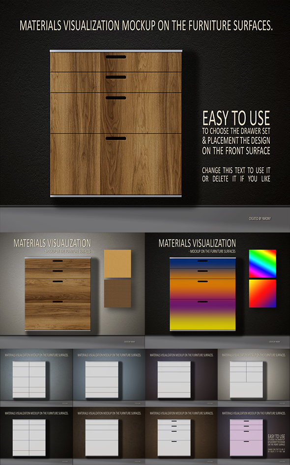
hi well the bottom lime is that u surprised me with this item lol i did not even know that such item could be required … maybe this is a niche and u are right to do just this , i guess that this is meant for architects . This is hard for me to “judge” such an item , as this is a bit difficult to evaluate the way the item may be used … i would thus rather comment abut th preview … , texts are very stuck, very compact and hard to read and quite frankly they do not make people feel like going into “deeper description”. BTW , u have a rather big issue of contrast, which is clearly not a good idea. It also seems to me that the shadow on the wall is sort of looking strange in this context as it looks like u applied a radial gradient and that only corner are having the shadow, i mena the dispotion of the shadow looks rather inadequate with the "room arrangement "
1 Like
Thanks for the answer, that is what I needed - someone who will look at it from the other side.
The text is just a gradient of information: first the motto/name and basic information, then more details. Now I see that this is more important than I thought before. I know that I should look more like a customer. And to work on the content.
A good point about the shadows, it actually looks like a bad mystification. At the moment I have no idea how to improve it. Maybe light and shadows in 3d Photoshop mode?
Thank you for your attention.
lol yeah u are describing a well balanced hierarchy of information in what u are saying, the problem is that this is not what u have at this stage … there would be no poblem if the thing was only meant for “notes” to your potential buyer, but in this case this is meant for himor her to edit it … and this is what is the real issue … as your text is too compact , and hard to read in the end …
as for the shadowing behind that i mention, just it even all teh way or just take it out … this is that easy … lol 3d ? what for buddy? just use a colorfill adjustment layer with a black tone and just play with the opacity afterwards , or, this is option 2 , just get rid of the the concerned layer where u have the radial gradient …
It is too simple in my opinion with very low selling potential. Also for this you have Twinmotion, SketchUp, Lumion that are extremely simple and intuitive software for interior design and architects.
1 Like
Ha ha, I was stupid and blind. Sorry, I didn’t understand you very well and focused on the model not the whole scene. I didn’t pay attention to this shadow because I can edit or turn it off. All elements in the project, including shadows, are separated and editable. I’m sorry, I guess I have to practice English in addition to graphics. 


Thank you for an advice.