
What do I do for this
That means your Resume has been rejected. Your design isn’t good enough.
1 Like
If you want to get feedback on your rejected item then you can post your demo here!


Anyone can do this without any design skills. Also you have many issues with typography, hierarchy, spacings and alignments.
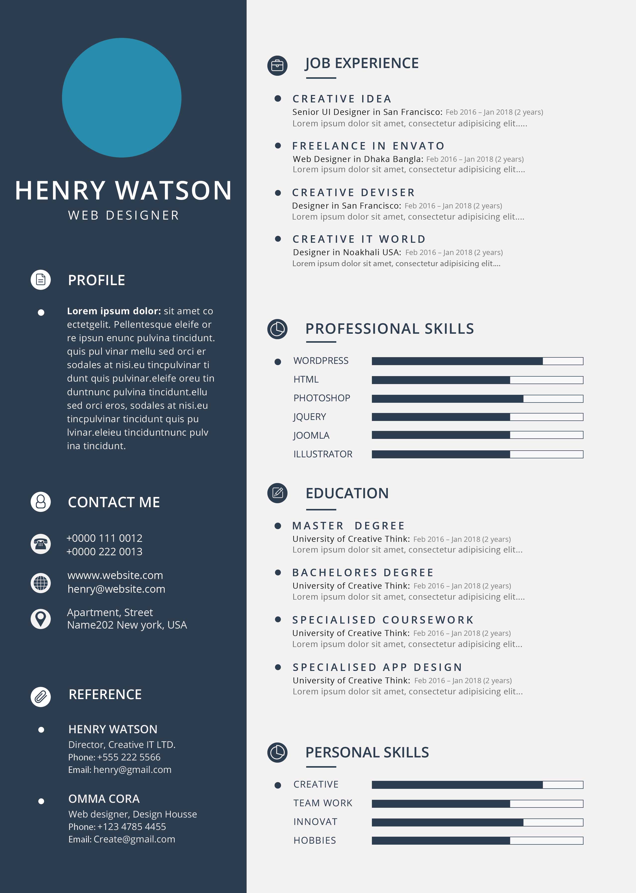
hi , pls do not get mr wrong this is rather clean and harmonious globally , but indeed, there is also much to say as regard to what u have to offer here , so let’s get started
1- general style
i am sorry to tell u just that but , let’s face it , once, u analyze the item , u come to the conclusion that what u get in the main file is block of texts, very simple icons in most cases, and blocks of colors, so this is not really super “elaborated” a content … see point 2
2- commercial potential
this may be sort of a standard to create minimalistic things, but indeed, think about it this way … if u are a potential buyer and u get to see this item , maybe u will be considering what will be included in the main file , the time that u save out of not doing by yourself or the skills that u may be lacking in order to redo it on your own and the fact of the matter is that buying this item is not synonymous with a real gain of time , so why would people buy it and reviewer accept it in a way? i would personally recommend that u push the envelope a bit graphic design wise and introduce some thing to make the item a bit more unique and make it a bit more difficult to redo
3- alignment
this is not a small issue as this is a basic design principle and violating it means troubles … indeed, this looks pretty strange to have the texts of other titles and subtitles not being aligned , especially as there is much space available on the right , see point 4
4- organization
if the content is harmonious there is all the same an issue as regard to the global organization as there are some areas on the right part of the cv which turn out to have nothing and come to contrast with more busy areas indeed
5- spacing
pls keep in mind that this is a template as so , u are expected to have a very professional work done all the way and what is expected from u is to keep a coherent organization , this includes having the very same spaces between each block of the right part for instance … look, the space between professional skills and education is really way lower than the one between all the other categories until this looks a bit like u have been placing blocks randomly …
6- coherence
i personally have a bit trouble to identify why in professional skills, there is one category with a dot and all the other ones do not have any … in the same kind of thinking way why personal and professional skills have the same icons while they are 2 operated categories? for me this makes very little sense as the content in both blocks is completely different and u actually wanted to separate the information according to the category that they belong to … finally about this part … why having “innovation” without a dot ? and why cutting the name while u have space enough to write it all?
7- icons
they are for most of them rather flat and a bit too basic / simple and they are clearly not sufficient to bring some real graphic design in this item
8- hierarchy
this is not really bad but there could be a better underlining of some elements and playing with some elements would help about it , pls see point 9
9- typo
once again this is sort of fair though , same goes a for the hierarchy is concerned , introducing some variations, font combinations and some touches of originality here and there would help to bring some relief to the table and for the reader to distinguish at first sight what really matters the most in terms of info and what is a bit more “secondary information”