I don’t know why my design is rejected anyone can help me and tell what’s the mistake.

1 Like
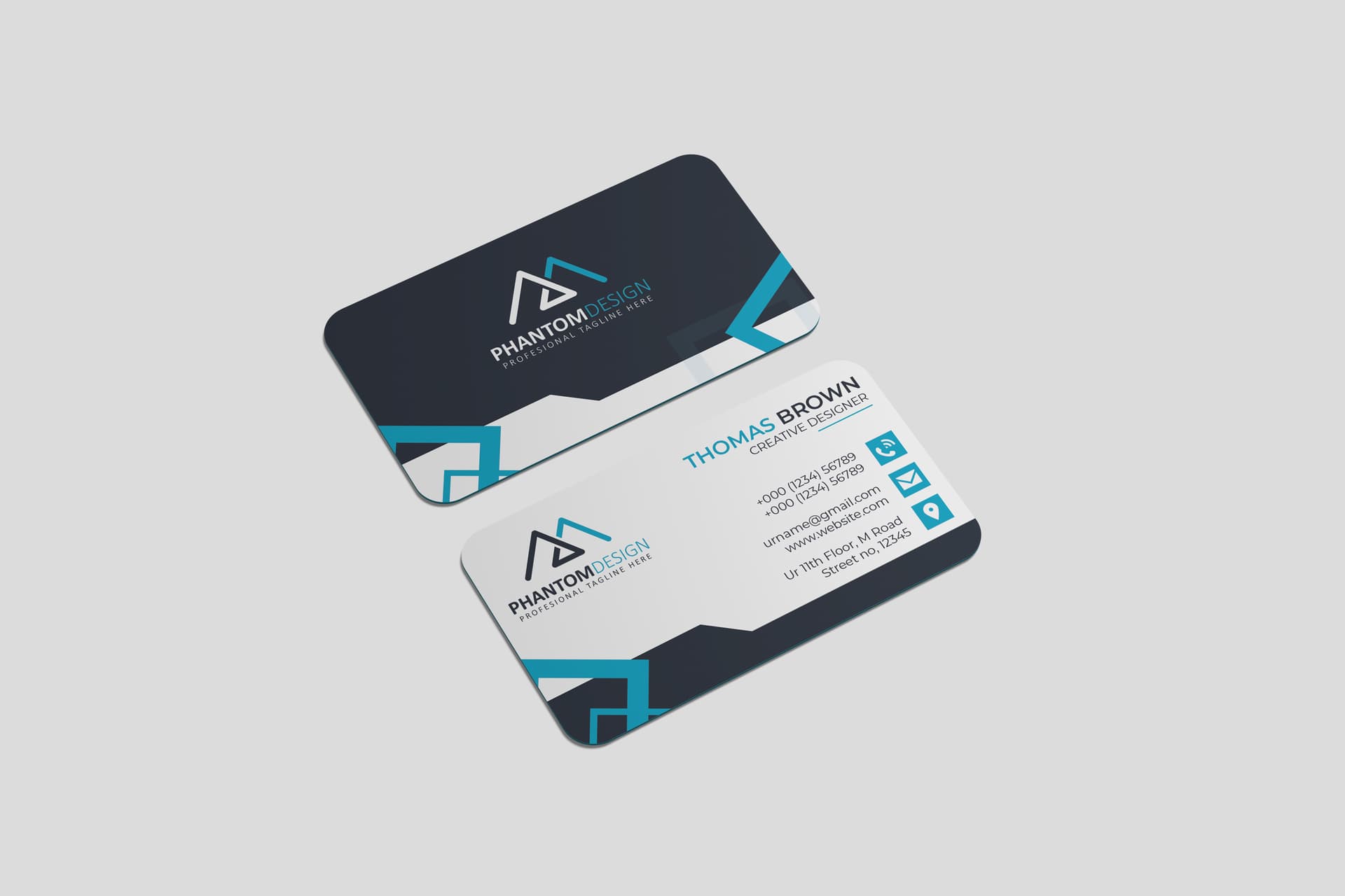
hi this is rather tasteful and there is a real attempt to bring somewhat new design wise, which is cool, now, there are issues about spacing, alignment and when it comes to the global occupation of the canvas . Look, for instance, the logo in the information side is way too stuck to the left margin and the direct result is a loss of impact of the logo, a feeling of choking and misbalance organization wise and a large gutter of white space between the logo and information elements. The background is still a bit simple if u ask me. Icons are way too simple and are definitely rather flattening the design than bringing it to the next level … I also know that all guys do this but this is a mistake to alter colors between first name and last name since u end up with a altered hierarchy of information, when both are equally important in the end …
1 Like
hey man
thank you so much
this is helpful for me